Replied in thread

@ecoscore
#SteveVai Surfing with the Alien
#SteveMillerBand Greatest Hits
#StevieWonder Songs in the Key of Life
#System7 777 Remixes
#Seal 1991
#SeaAndCake Oui
These are all on my phone.

@ecoscore
#SteveVai Surfing with the Alien
#SteveMillerBand Greatest Hits
#StevieWonder Songs in the Key of Life
#System7 777 Remixes
#Seal 1991
#SeaAndCake Oui
These are all on my phone.
System 7 : 'Live Transmissions 02' pre-order new CD for 11/04 release #System7 #SteveHillage #MiquetteGiraudy https://planetgong.co.uk/bazaar/cd/system-7-live-transmissions-02.shtml
In case you're wondering; Technically these came as two separate color variants (one blue, one "vintage" beige), but I thought it'd be kind of fun to go duo-tone on them. Here's a photo of them together.
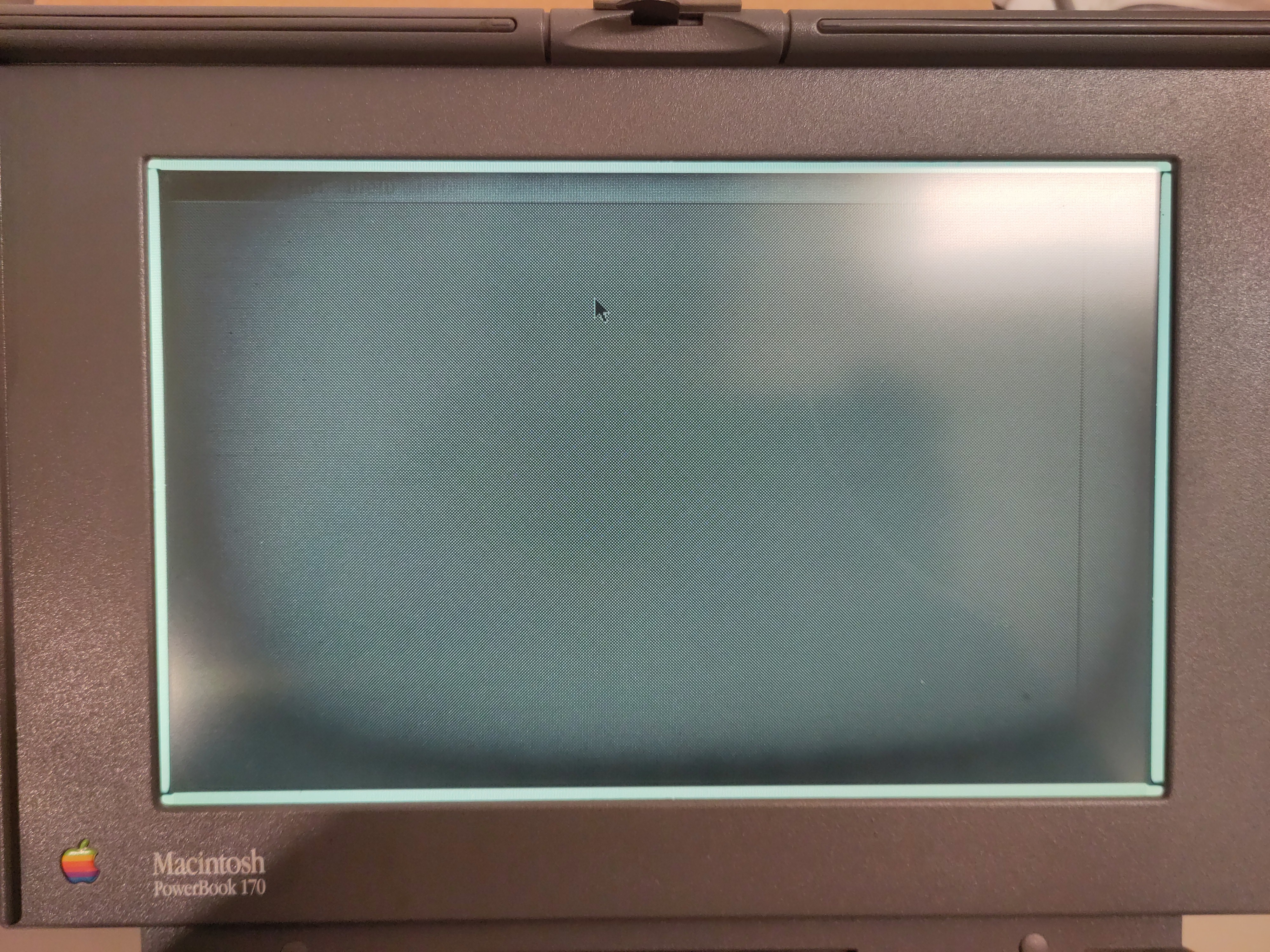
#Tashpad #RetroComputing #ClassicMac #Gaming #System7 #Macintosh #ColorClassic

 #NowPlaying on #BBC6Music's #ChrisHawkins
System 7:
 Faydeaudeau
https://system7.bandcamp.com/track/faydeaudeau
https://open.spotify.com/track/5y4JgA4DqeWCzP6tOB2zcy
Please  BOOST to share what you like
- your followers don't see if you  favourite a post
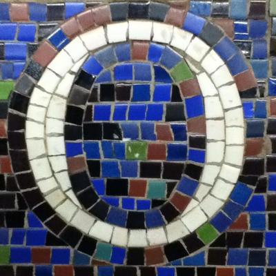
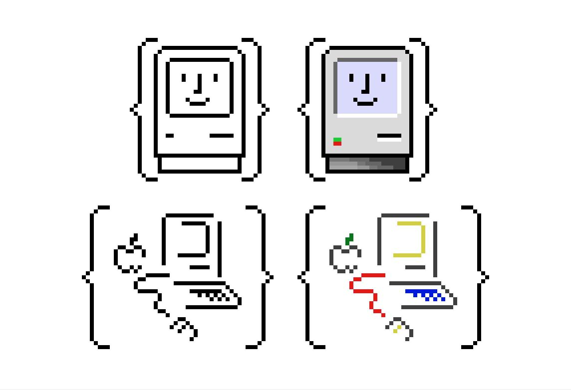
Man, I just spent way too much time making these. #ClassicMac #System7 #Icon #Pixels
System 7 - Davy Jones' Locker (The Orb Mix)
https://www.youtube.com/watch?v=YNzbri2yiao
Ce morceau (et particulièrement ce remix par The Orb) est toujours une bouffée d'air, d’oxygène pur, qui me met en mouvement, me donne de la puissance malgré son calme...
Comme un puissant fleuve ambiant dub.
Did anyone ask for this? No. Does this solve any problems? Also no. Did I have fun building it? Hell yes.
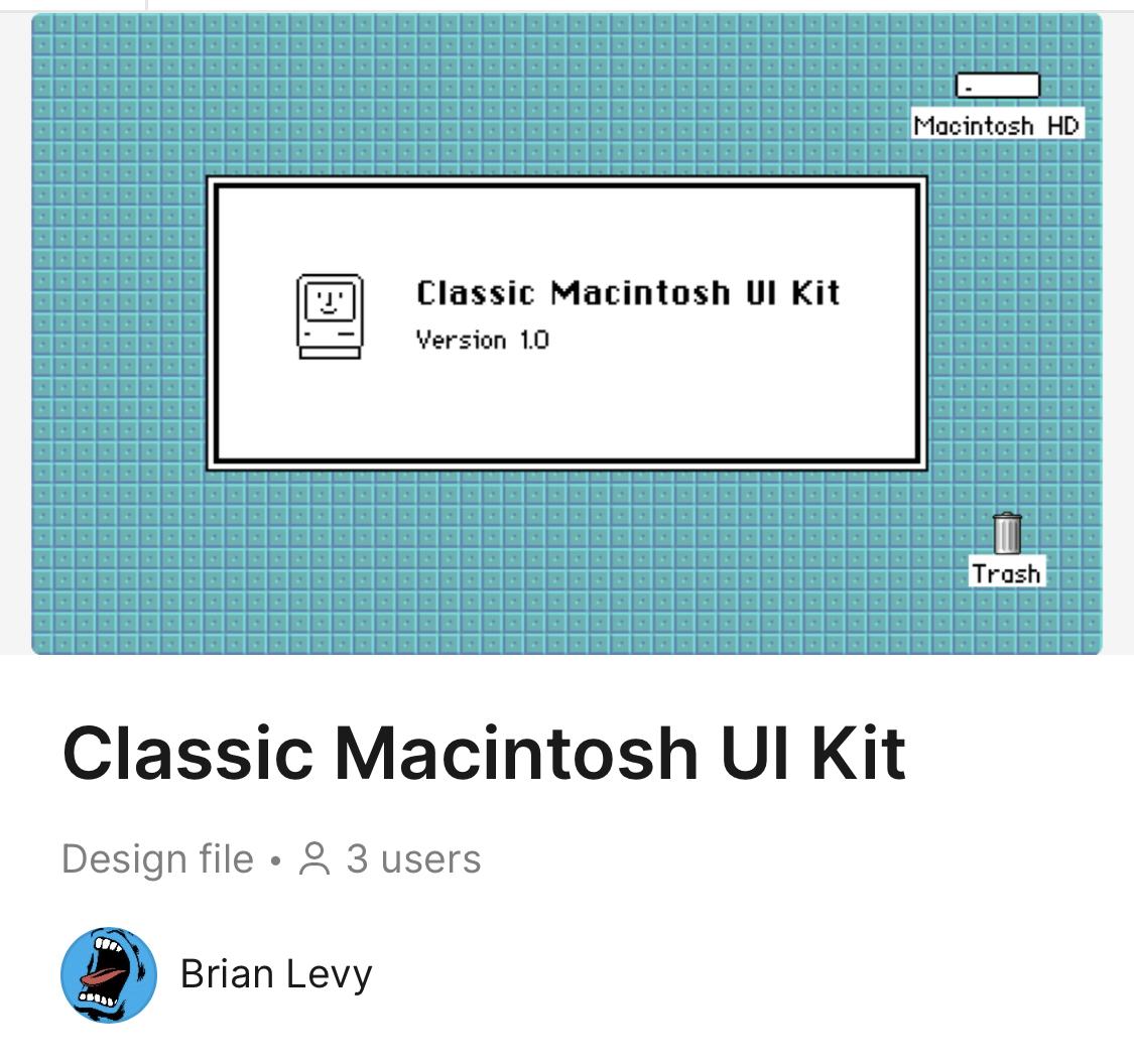
https://www.figma.com/community/file/1392611044307310359/classic-macintosh-ui-kit
I'll check it out.
You have to understand, when I was getting heavy into computers circa 1990, vector fonts only existed in high-end printers, and via fairly expensive software ("Adobe Type Manager").
Then in mid-1991, Macintosh #System7 came out with its own awesome TrueType system and vector fonts, and I was in hog heaven! I could see fonts at 127 point and see the details of EVERY curve. Absolutely perfect!
Also perfect was the fact that those fonts were being rendered at 72 dpi on monochrome, and used hand-drawn/tweaked bitmapped fonts at low point sizes (24 pt and below, except for odd in-between sizes like 11, 13, etc.)
Nowadays, the screens I use are much higher resolution, but NOT "HIDPI." They're also full color.
So, bitmapped fonts are OUT, even as a backup for small point sizes. Fuzzy antialiasing is in -- neither the really nicely pixel-oriented AA of windoze, nor the "screw the pixels/hinting, full, perfect vector shapes ahead!" AA of MacOS.
So, older eyes, 96ppi screens, AA... it's a fuzzy existence.
I love vector fonts in principle. I still can't get over the crispness of nice bitmapped fonts at low resolutions in practice.
This is a recent revelation to me.
cc: m0xee@librem.one
4,000,007 reasons to upgrade to System 7? But this only has 7 on it!

Search my computer for "Mac Paint" ... it suggests Wikipedia.
Search the internet for "mac paint internet archive" ... it emulates it!
https://archive.org/details/mac_Paint_2
Infinite nostalgia.

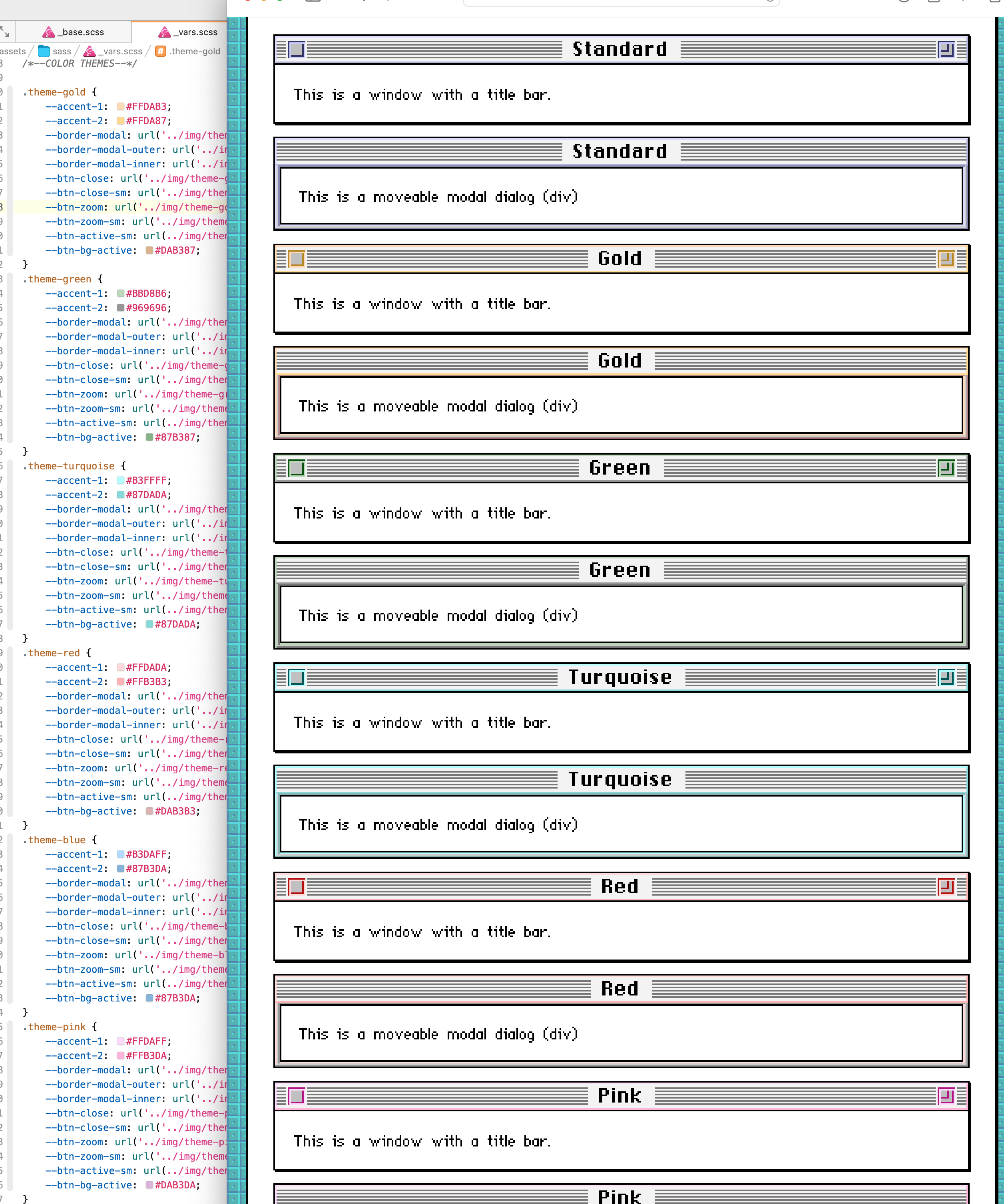
More screwing around. This time changing window colors via CSS custom properties. #Macintosh #System7 #CSS
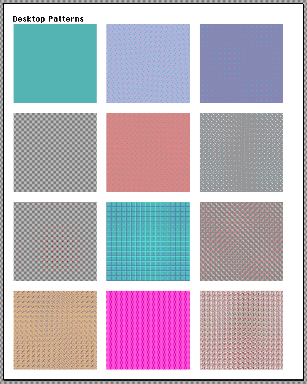
Of course I just recreated the default System 7 desktop patterns with SVGs. #ClassicMacintosh #Macintosh #System7
Apple Archeology: The Future Once Had Server Side Computing In It - To read the IT press in the early 1990s, those far-off days just before the Web wa... - https://hackaday.com/2023/11/17/apple-archeology-the-future-once-had-server-side-computing-in-it/ #retrocomputing #system7 #apple #aix #ibm


 #NowPlaying Bot


”. Below the text, there are images of an Apple Watch labeled ‘A’ and a software box for “Conflict Catcher 3” labeled ‘B’. Further below, there’s promotional text detailing an offer related to upgrading to Macintosh System 7.5. The bottom section contains logos for Macintosh and Apple along with more promotional text in red and black. The ad suggests that purchasing a new Macintosh or PowerBook after October 1, 1994, that doesn’t already have system software version 7.5 installed on it, would qualify the buyer for a free upgrade to System 7.5. The offer is valid through March 31, 1995, or while supplies last.")